
We Customize Everything— Proudly Since 1922
800-458-1244 [email protected]
Custom Request We Customize Everything— Proudly Since 1922
What Is the Best China Hospitality Wayfinding Signage? The answer begins with movement, not decoration. Guests enter a hotel carrying luggage, checking phones, and scanning unfamiliar spaces. A clear sign beside the lobby lift can prevent hesitation before it becomes frustration. Effective hospitality wayfinding signage connects entrances, reception desks, restaurants, meeting rooms, and guest floors through one readable system.
The evidence supports this practical focus. J.D. Power’s 2024 North America Hotel Guest Satisfaction Index Study examined more than 39,000 guest responses across major hotel experience categories. Its findings reinforce a simple lesson: small operational touchpoints shape overall satisfaction. Deloitte’s 2024 European Hotel Industry Survey also highlights the importance of seamless, technology-supported guest journeys. Digital maps help, but physical signs remain essential when batteries fail, networks slow, or guests need instant reassurance. The Sign Research Foundation’s research on on-premise signage further links visible, well-maintained signs with business credibility and customer decisions.
David Gibson, author of The Wayfinding Handbook, describes wayfinding as “the process of using spatial and environmental information to navigate to a destination.” That definition is useful in Chinese hospitality projects, where language, cultural expectations, architectural scale, and visitor density may differ sharply. English alone is rarely enough. Pictograms, Chinese-English naming, floor numbers, contrast, lighting, and consistent arrows must work together.
A beautiful sign can still fail.
The strongest system is usually quiet, predictable, and easy to test. Walk the route with a first-time visitor. Notice every pause. Some recommendations may seem obvious, and that is a weakness worth admitting. Real performance matters more than impressive mock-ups. The best hospitality wayfinding signage reduces questions, supports accessibility, and lets guests feel oriented within seconds.
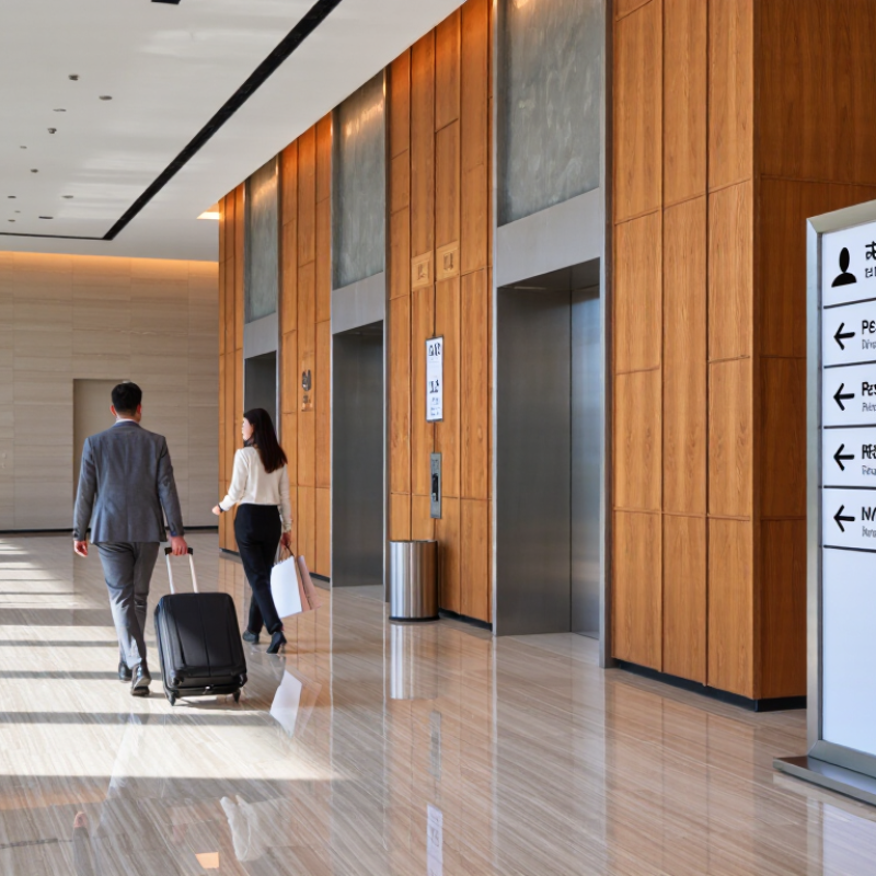
China hospitality wayfinding signage is a coordinated visual system for guiding guests through hotels, resorts, restaurants, and cultural properties.
Clear Chinese characters, English translations, pictograms, arrows, colors, and floor numbers should work together. Signs belong near decision points, such as lobby entrances, elevator exits, corridor intersections, and parking routes. They should remain readable under warm lighting and during busy arrival periods.
International travel is also becoming more diverse. UN Tourism reported about 1.4 billion international tourist arrivals in 2023, nearly returning to pre-pandemic levels.
The World Health Organization estimates that 1.3 billion people, or 16% of the global population, experience significant disability.
China hospitality spaces therefore need signage that supports different languages, ages, and abilities. High contrast, tactile lettering, accessible routes, and consistent symbols are not decorative additions. They are essential service details. A visually elegant sign can still fail if guests must stop and ask staff for directions. That weakness deserves honest review.
Tips: Test every route with real users, including international visitors and wheelchair users. Keep wording short. Use one naming system across maps and signs. Confirm translations with qualified language professionals. Check viewing distance, glare, mounting height, and night visibility on site. Some designs look accurate on a screen but feel confusing in a crowded lobby. Review them again.
It is a visual system that guides guests through hotels, resorts, restaurants, and cultural properties. It answers, “Where am I?” and “Where should I go next?” Clear signs reduce repeated questions at reception.
Place them at lobby entrances, elevator exits, corridor intersections, and parking routes. Guests need guidance before making a turn. A sign beside the destination may arrive too late.
Chinese and English are commonly used in many Chinese hospitality spaces. Keep translations consistent across signs, maps, and digital displays. Confirm wording with qualified language professionals.
Organize information around arrival, public zones, service areas, and private rooms. Use large signs for major directions. Smaller signs can identify rooms, facilities, and floor details.
Common types include entrance signs, reception signs, floor directories, room numbers, lift indicators, and restroom markers. Suspended signs remain visible above crowded guests. Small tabletop signs can guide breakfast traffic.
Use high contrast, tactile lettering, accessible route markers, and familiar symbols. Do not rely on color alone. Check mounting height, viewing distance, and wheelchair routes with real users.
Use both when practical. Digital displays can change quickly, while printed signs remain useful during network failures or crowded events. A backup sign is often worth the wall space.
Walk every route like a first-time guest carrying luggage. Test tired visitors, international travelers, older guests, and wheelchair users. Check glare, warm lighting, hidden signs, and confusing arrows. A polished screen proof can still mislead.
Thin lettering may disappear under warm lobby lighting. Plants, crowded walls, and decorative materials can hide important directions. Elegant design is not always effective. Review the awkward turns again.
Leave space for future facilities and maintain one naming system. Review signs after real guest feedback, not only after design approval. Some routes may still feel awkward. That is useful evidence.
The best hospitality wayfinding signage creates a clear, comfortable, and consistent navigation experience for guests in hotels, resorts, restaurants, cultural venues, and other hospitality environments. It combines directional signs, identification signs, destination markers, maps, room numbers, and digital guidance into one coordinated system. A well-structured solution helps visitors understand where they are, where they need to go, and how to reach their destination efficiently, whether they are entering the property, finding facilities, or moving between indoor and outdoor areas.
Effective signage should use simple wording, readable typography, logical information levels, visible placement, and consistent colors or symbols. In Chinese hospitality venues, cultural awareness is equally important, including appropriate bilingual communication, respectful visual choices, and intuitive references to local layouts and guest expectations. Selecting the right hospitality wayfinding signage requires studying visitor routes, accessibility needs, lighting conditions, architectural features, and operational goals. Careful planning, testing, installation, and ongoing maintenance ensure that the final system remains useful, attractive, and easy to understand.